If you’re looking for how to create a photo gallery in WordPress, this post will guide you on how to do that.
For a site I was working on, I wanted to create an efficient and minimalistic photo gallery.
There are a lot of plugins that allow you to do this, but many seem to be bloated with a lot of additional features you might not need.
Instead, today I’ll show you how to create an efficient photo gallery that uses lightbox–that is, where the image popups when clicked in an overlay over the current webpage (just like Facebook uses).
Additionally, users will be able to easily share the images directly from the lightbox overlay.
And it will be responsive, working well on tablet and mobile.


Let’s get started:
Setting Up the Default WordPress Gallery
WordPress has a built-in default gallery that you can add to pages/posts.
When making a post and adding media, you will see the following:
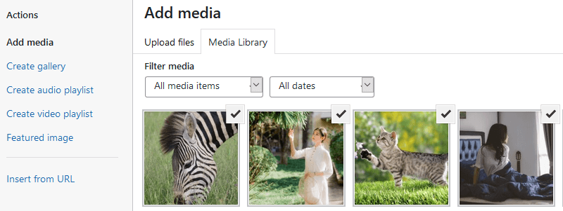
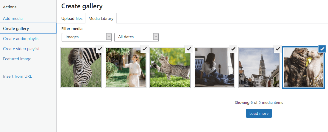
On the left hand menu, notice the “Create Gallery” option. Once you click that, you can make a custom gallery of chosen images.
In the right column, I like to set the Gallery settings for “Link To” to “Media File”; this way, when an image is clicked from your gallery it will open it directly to the image file.
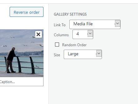
The other option is size. This can vary by theme settings, but it should set the size of images displayed (prior to being clicked) to use either thumbnail size, small, medium, or large images.
Whenever you upload an image to your site, WordPress automatically generates these various image sizes by creating independent images of the source image in these respective size templates.
For my case, I like to use medium or large, since I want my gallery grid of images to be a decent size.
Next, we can publish and view the gallery.
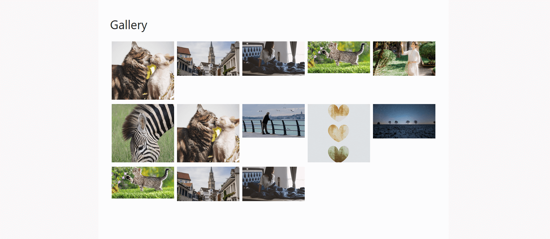
So, now we have a gallery. But the images don’t look the way I want.
For starters, they are too small for my liking.
Despite choosing “Large” sized images, because I chose 4 columns the images are forced to shrink to fit the content container.
To fix this, we can set this page as a Full Width page, so the container the images are in will expand to the edges of the page.
Back in post editor, there should be a setting called something like “Post Attributes” or “Layout” which allows you to change the “Template”.
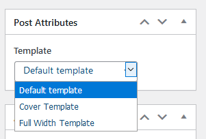
Here you will change it from “Default Template” to “Full Width Template”
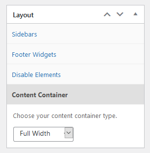
The theme I am using for this photo gallery is GeneratePress, which I highly recommend for just about any site.
With GeneratePress, there are very easy options for making pages full width or removing sidebars or changing their positions on a per page basis.
Now, we can see the gallery is looking a bit better, with bigger images, which I think looks more modern.

Changing Columns By Screen Size
One problem we’re still left with is the 4 column images looks good on desktop view.
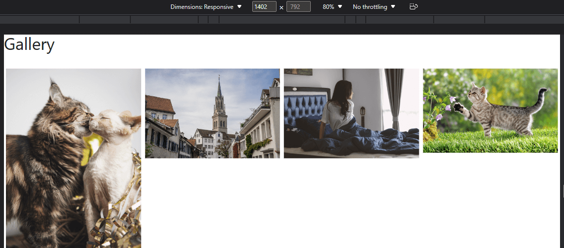
But when the webpage goes responsive, the images will stay with 4 columns and it makes the images too small, in my opinion.
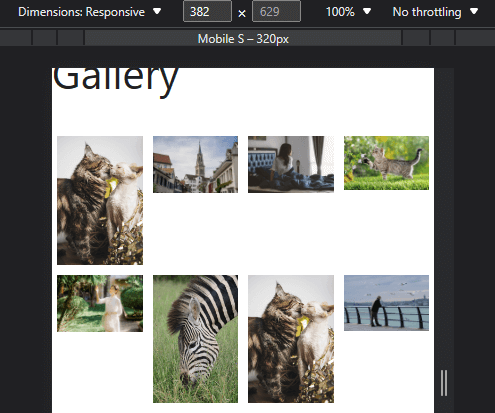
We can change the columns in the post editor for the gallery, but the issue is that it will change it for all aspect ratios, and I like desktop view having 4 columns.
The solution is to use some CSS to make the columns change based on the screen dimensions.
Right click on one of your images and select “Inspect”.
Here you’ll be presented with the HTML of the webpage, with the image’s HTML highlighted.
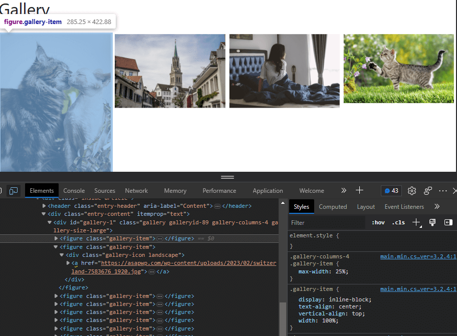
Your webpage is structured with containers (basically 2d boxes) inside of other containers in a hierarchy.
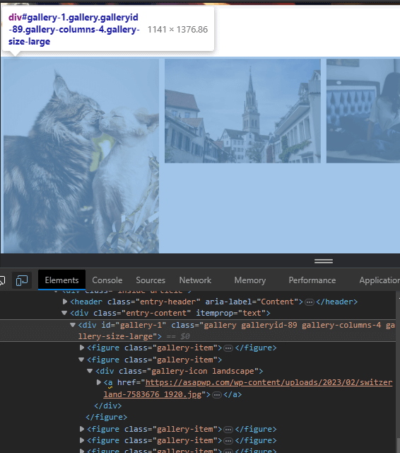
The HTML can differ with different themes, but generally you’ll want to find the uppermost HTML container, before it starts to encompass more than one individual image.
For example, in the image below, I went too far, the selected HTML container encompasses the entire gallery as you can see:
 But in this next image, I’ve found the uppermost container before it starts to group more than an individual image.
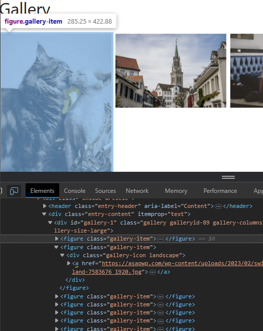
We can see the class then is gallery-item.
And if we look in the right-hand pane, where the CSS is, we can see how that HTML element is currently being styled with CSS.
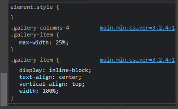
In this case, it’s:
.gallery-columns-4 .gallery item {
   max-width: 25%;
}
Max-width instructs the image to not go beyond a width of 25% of the container it’s in.
Therefore, no matter the screen resolution, it will always constrain to these requirements.
Now that we know the CSS, we can fix this whole issue with some media queries.
With media queries you can apply separate styling to HTML elements based on, in this case, the screen width.
@media screen and (min-width: 1080px) and (max-width: 1399px) {
.gallery-columns-4 .gallery-item {
   max-width: 33.33%;
}
}
@media screen and (min-width: 731px) and (max-width: 1079px) {
.gallery-columns-4 .gallery-item {
   max-width: 33.33%;
}
}
@media screen and (max-width: 730px) {
.gallery-columns-4 .gallery-item {
   max-width: 50%;
}
}
The first part of the CSS code makes it so when the screen size is between 1080px and 1399px (tablet size) it will reduce the columns to 3.
@media screen and (min-width: 1080px) and (max-width: 1399px) {
.gallery-columns-4 .gallery-item {
   max-width: 33.33%;
}
}
The second part of the CSS code makes it so when the screen size is between 730px and 1079px (smaller tablets) it will also reduce the columns to 3.
@media screen and (min-width: 731px) and (max-width: 1079px) {
.gallery-columns-4 .gallery-item {
   max-width: 33.33%;
}
}
The third part of the CSS code makes it so when the screen size is between 730px or less it will reduce the columns to 2.
@media screen and (max-width: 730px) {
.gallery-columns-4 .gallery-item {
   max-width: 50%;
}
}
You can change these widths to whatever you want.
I just like it to be 4 columns on desktop, 3 columns on tablet, and 2 columns for small tablet-mobile phones.
For my particular likings and theme, those numbers seem to work well enough.
Desktop view

Tablet view
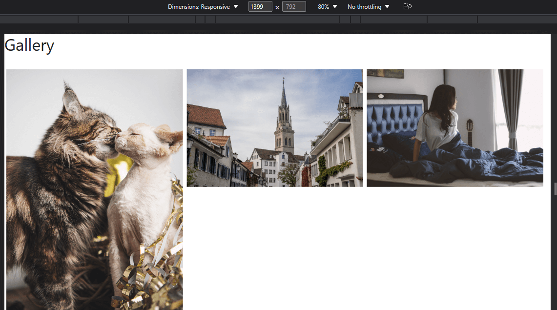
Mobile view
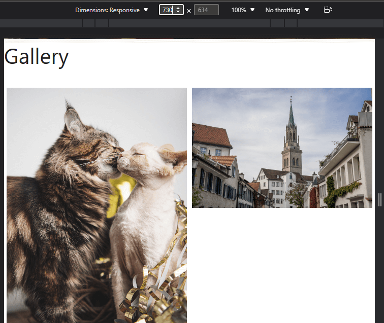
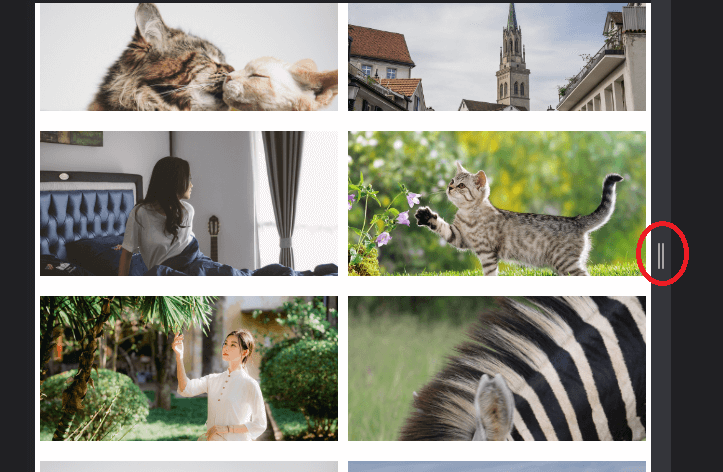
You can preview how your gallery will look at all screen dimensions.
After you right click the webpage->Inspect, you want to click the little smartphone looking icon on the bottom pane.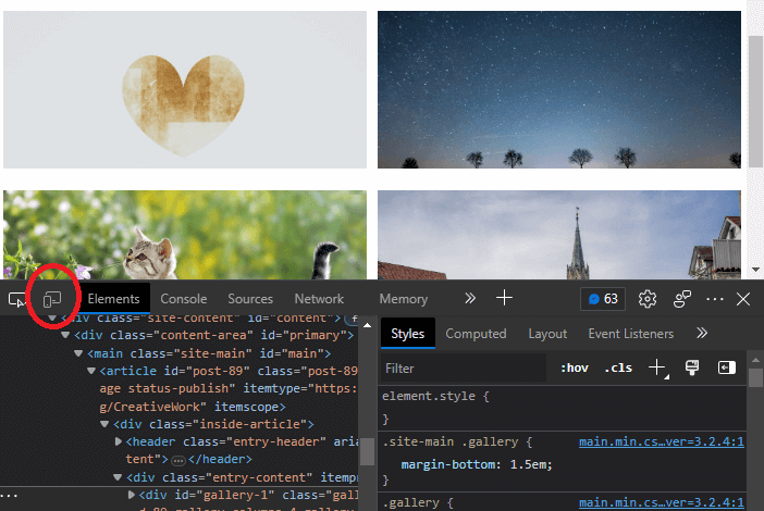
Now, at the top of the screen you will see the current dimensions.
Simply make sure “Responsive” is selected.
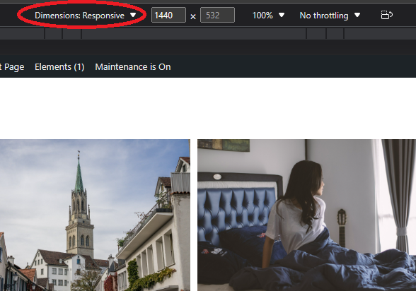
Now you can adjust the screen size by dragging the sides around, and it will fluidly show the changing dimensions.
Making Images Uniform
There is still another problem I do not like.
Because the images themselves are in different aspect ratios–some wide, some vertical, etc.–there are white spaces everywhere.
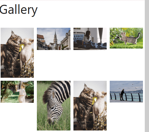
One way to fix this is to standardize the covers of these images all to a specific size.
This can be achieved again with CSS.
Note: It won’t change the actual image sizes, it will simply make the containers they reside in all shrink to the same size so they look better.
To do this, we target the container the images are situated in. From the previous section, you’ll remember this is gallery-item.
.gallery-item {
   overflow: hidden;
   max-height: 200px;
}
Max-height: 200px; forces the image container to not exceed a height beyond 200px.
Overflow: hidden; stops the images from overflowing out of the now reduced-height container.
The result is all images appearing the same:

Probably, you will notice a problem with tablet and mobile views where the heights are still irregular.

So, you can add this code as well, and play around with the height numbers until they are the same across all screen widths.
For me, this works:
.gallery-item {
   overflow: hidden;
   max-height: 200px;
}
@media screen and (max-width: 968px) {
.gallery-item {
   max-height: 150px
}
}
@media screen and (max-width: 480px) {
.gallery-item {
   max-height: 120px;
}
}
Now it will look good at all screen dimensions from desktop to tablet to mobile.
Desktop view

Tablet view

Mobile view

Now that this is done, we are left with one last problem.
When you click the images they open up directly into the image’s URL on a new page.
Instead, we want them to open in a snappy lightbox, with easy scrolling between images, without having to load different webpages.
For this, we need the following:
Lightbox with Photoswipe
For setting up a WordPress Lightbox picture gallery, the free plugin I chose to go with was Lightbox with Photoswipe.

It’s a simple minimalistic WordPress image gallery plugin that allows us to do exactly what we need.
Simply install the plugin and activate. Next, go to “Settings” in WP admin sidebar -> Lighbox with Photoswipe.
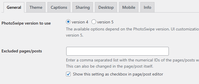
In the General tab, change “Photoswipe version to use” to v4 if you want users to be able to share your images directly from the lightbox overlay.
Next, go to “Sharing” tab and select the options you like.
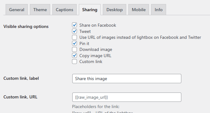
Feel free to go over any other settings here and change them, although leaving the rest at their defaults should be fine.
After you’re done, you can head to your gallery.

What you’ll notice is images now open up in a lightbox when clicked.

And in the top right, notice the share logo. When clicked, users will easily be able to share your images to chosen social website.

Conclusion
Setting up a photo gallery that uses lightbox is a great way to better feature your photos to site visitors.
With a bit of CSS code and a minimal plugin, you can create an efficient WordPress photo gallery with lightbox capability and the ability to easily share photos.
